“Art washes away from the soul the dust of everyday life.” Pablo Picasso
I always wanted to draw and paint from a very early age (facilitated to some degree by my recuperation from asthma related chest infections during the winter months of my school days). Early artistic influences start with my late mother, Joyce Clarke, who loved to paint with watercolours and oils and always encouraged me with my artistic skills. Although she was a very talented artist and clothes designer at a young age, she was discouraged from furthering her art and design skills at art college and was encouraged to get a job instead (a familiar path of young working class women in the early 1950’s).
In comparison I was very fortunate to have got the chance to study for my degree (in graphic design) and it was largely thanks to mum giving me extra help with my education and her faith in my artistic abilities. My dad, George, was also very helpful, especially later with my furniture making business (that ran along side my art work) allowing me to use his prefab concrete garage when I became self employed in 1985 (and it still exists with the same double doors I made back then on a B&B workmate!).
My early painting ‘style’ was greatly inspired by Charles Tunnicliffe, especially his illustrations in my collection of small ‘Ladybird’ nature books. David Gentleman, Rowland Hilder and Jack Merriot were also early influences to name but a few. Three other ‘great’ artists whom I frequently return to for inspiration are Paul Cezanne, Edward Hopper and John Singer Sergeant. There are many contemporary living artists whose work I follow on Instagram and other social media platforms.
In 2022 I completed a wonderful three day painting course based at Newlyn School of Art, taught by the superb painter of the Cornish coast, Paul Lewin (a 60th birthday present from my wife Mel!). I have long admired his wonderful mixed media studies of Cornwall. Pictures that I completed can be seen on the coastal paintings page of this website.
Technical
I am pretty well self taught when it comes to painting techniques, having not received formal tuition from any particular professional artist or educational institution (despite attending art school for four years: a one year foundation course followed by a three year degree course in graphic design). College tuition, in terms of practical applications, was mainly about drawing practice and developing different ‘ways of seeing’ (John Berger’s book of the same name was always recommended reading). Novel ideas that could be developed in all subject areas were the main aspirational goals.
The limited palette of Winsor & Newton colours I have used over recent years include: French Ultramarine Blue, Winsor Blue (red shade), Cadmium Lemon, Yellow Ochre, Alizarin Crimson and Burnt Sienna for all mediums (the latter colour I am tending to replace in favour of Light Red). I also use Cerulean Blue and Cadmium Orange when needed. I use these across all mediums inc watercolour, oils, acrylics and gouache.
I use ‘mixing white’ to tint opaque oil colours – often painting a layer of white paint on the area of sky – followed by a pale mixture of winsor and ultramarine blue for the blue sky, leaving white paint spaces for clouds – adding grey tones to these as needed (this technique is used for painting skies in pure watercolour ‘wet into wet’ – leaving white paper as the lightest cloud tone). I try to use the wet into wet painting technique (using traditional oils) as far as I can in terms of completing the painting and covering the surface if there’s time – blending the pigments/colours/tones is much easier and starting with the lightest tones (as per per watercolours, which have left their influence upon me!). It is very much the reverse of the ‘old masters’ technique where the darkest tones were painted in first and the lightest last. I use boiled linseed oil as a thinning medium for oil paint where needed.
To clean oil paint from my brushes, I reuse some old white spirit thinners which are kept in two glass bottles. The clear liquid is used to when the old pigments have sunk to the bottom.
I am a bit wary of using acrylic paints these days, mainly due to disposing of the brush cleaning water that contains plastic polymer particles which no doubt pollute water courses when tipped down the drain, I store this in large plastic milk containers and use the old seal under the cap to stop leakages when recycled (alternatively waste water can be poured onto cat litter to dry out and then disposed of safely).
I enjoy using acrylics as per watercolour techniques (with or without white pigment), building up multiple transparent washes/layers (especially on canvas) without causing the deadness that most often occurs when trying to do the same with watercolour pigments when they are overpainted.
Landscape Paintings
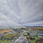
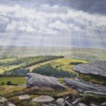
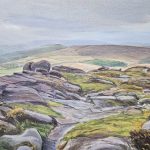
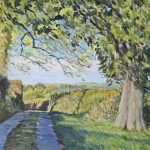
Observational drawing is a very important part of my work, I like to do justice to the scene whether I’m in the studio or outside in the countryside, aiming to capture the unique character and beauty of the Peak District (or that of a particular species of tree).
It’s great to produce landscape paintings out on site when possible, the end result of working on location is a looser more spontaneous approach where I feel that I am as one with the scenery – painting almost subconsciously – but still aiming to do justice to the general topography, flora and fauna and light effects of the scene. I often use our old VW campervan as a studio parked in a safe spot with a paintable view.
I use my own original digital photographs as reference material for studio paintings (using the back lit images on my smart phone, making adjustments for colour and tone, rather than from printed photos on paper) and traditional a sketchbook to record scenes when there’s insufficient time to paint decent pictures on site. This visual information enables me to produce more detailed figurative landscape studies without being to detailed, concentrating on pictorial composition and the effects of sunlight on the landscape whilst trying to be fluid in my approach.
In each oil painting you can see multiple textural brushstrokes, in isolation these small areas of painted surface could be seen as abstract paintings in their own right. I try to avoid using fine detail brushes in favour of large filbert (for oils) or round or chisel shape brushes (for waterbased mediums).
In 1983, my watercolour painting of Bradbourne Mill, Derbyshire, won the Munroe Trophy in the Derbyshire Open at Buxton Museum and Art Gallery, Derbyshire.
Some years ago now I started signing the front my paintings with my initials ‘NAC’ instead of ‘Neil A Clarke’ which I feel is less intrusive to the image compared to a full name (the latter is signed in pencil on the reverse side along with the title and picture number and date). I have added a red background to my initials when using opaque mediums, inspired by the tin can I featured in one of my older paintings of Dovedale called ‘After Hours’ (as a pictoral protest against people leaving litter in their wake!).

Reflection Paintings
I also produce studio based paintings which depict reflected images on glass surfaces – often a multiplicity of perspectives – aiming to challenge my own observational painting abilities and those of the picture viewer; creating rather ambiguous but intriguing imagery. I use my own photographs as reference material – aiming to add an extra dimension to the image by transcribing them into paintings.
This subject matter is a way of moving towards producing work of a more abstract nature where I could experiment with technique and materials to create less figurative artworks and to incorporate more design processes into the image composition. I have begun this process with my 4th version of the German Pavilion, Barcelona, called ‘Cool Pavilion‘.
In 2005, my watercolour painting of the German Pavilion, Barcelona, won 1st prize at the Royal Birmingham Society of Artists ‘Open all Media’ spring exhibition.

Architectural Paintings
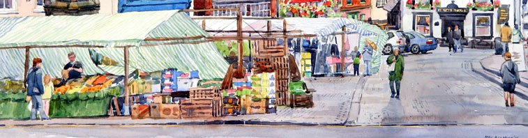
I’ve been producing paintings of Derbyshire towns and buildings for forty years or so now, each painting eventually becoming a closely observed record of a place in time before the inevitable alterations occur that can completely change the character of a street/town/city for better or worse.
Coastal Paintings
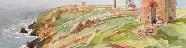
The Atlantic coast of the Penwith Peninsula, west of St Ives, Cornwall, as some of the finest coastal scenery in the UK. It reminds me so much of parts of the Peak District, but with the added ingredient of the Atlantic ocean as an awe-inspiring backdrop. I have also really enjoyed trying to capture the unique coastal scenery of Northern Ireland following a holiday there with my daughter in 2023.
Commissioned Work
I can undertake commissioned work, whether as line drawings for illustration purposes or paintings of landscapes, houses or gardens for special commemorations/events.
Exhibitions
My work can be made available for exhibitions in the UK.
I have previously exhibited my paintings in the following places/organisations:
Nottingham Castle Art Gallery (City Open Art Exhibitions)
Derby City Art Gallery and Museum (City Open Art Exhibitions)
Buxton Museum and Art Gallery (Derbyshire Open Art Exhibitions)
The Royal Birmingham Society of Artists Gallery, Birmingham
St John Street Gallery, Ashbourne (now called the Courtney Gallery)
Opus Gallery, Ashbourne (2010-18)
Current Art galleries that stock/sell my work include:
Courtney Gallery and Cafe, Ashbourne, Derbys DE6 1GH Tel: 01335 347425. www.courtneygalleryandcafe.co.uk
Derwent Gallery, Grindleford, Derbyshire UK. info@derwentgallery.com www.derwentgallery.com
Hartington Farm Shop and Cafe, Hartington, Derbyshire SK17 0AN www.hartingtonfarmshop.co.uk
All images – Copyright © Neil A Clarke. Any form of reproduction, transmission, manipulation, display or other usage without permission is strictly prohibited.